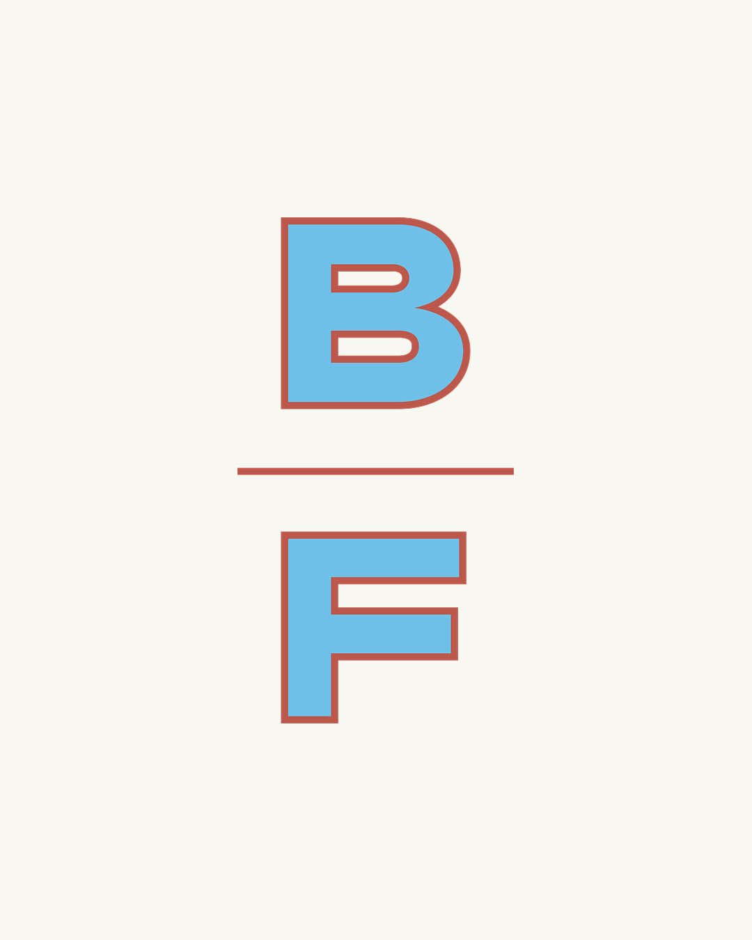
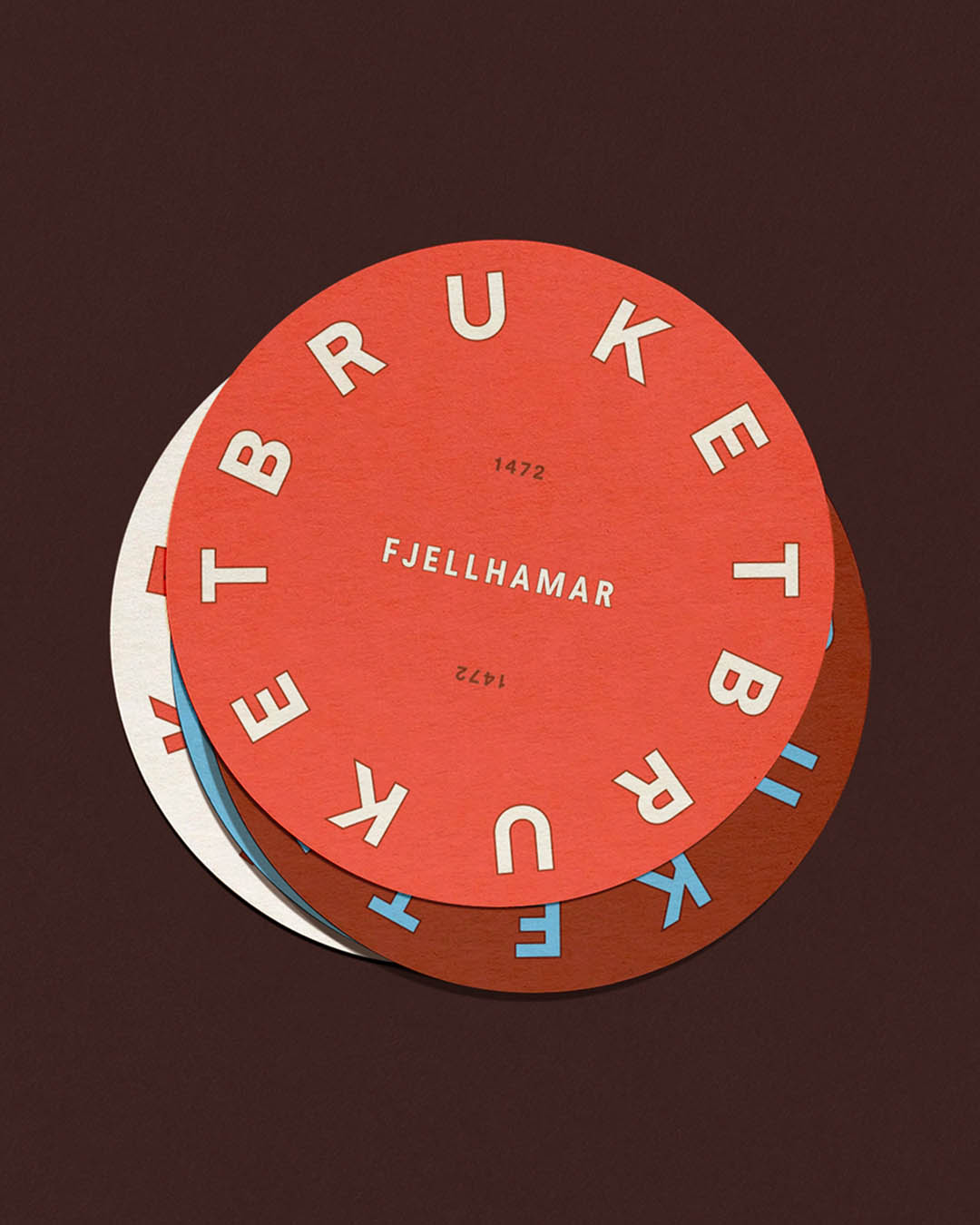
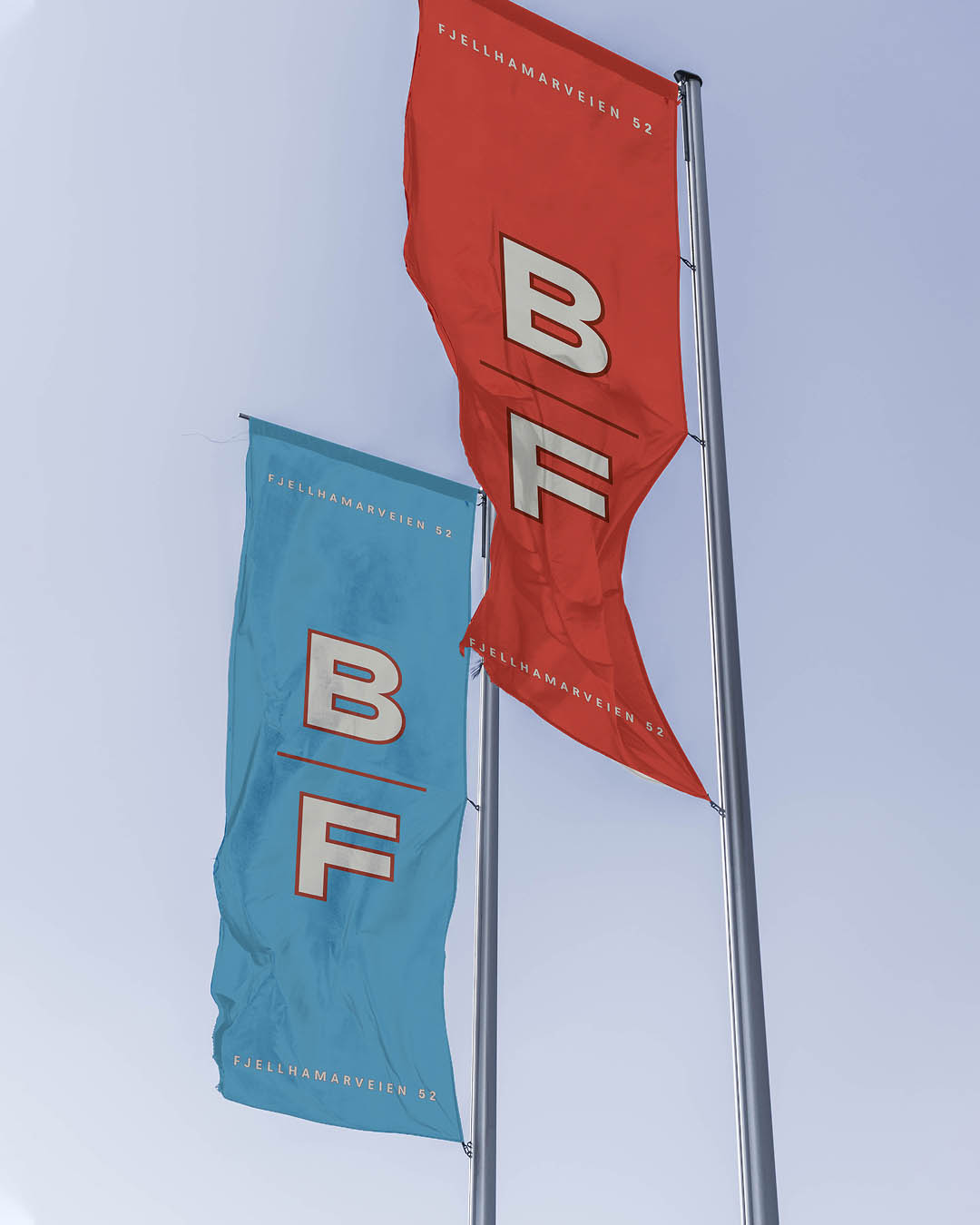
The logos and monogram draw inspiration from historical typographic treatments of the Fjeldhammer Brug name, adapted across multiple formats.
The logos and monogram draw inspiration from historical typographic treatments of the Fjeldhammer Brug name, adapted across multiple formats.
The logos and monogram draw inspiration from historical typographic treatments of the Fjeldhammer Brug name, adapted across multiple formats.
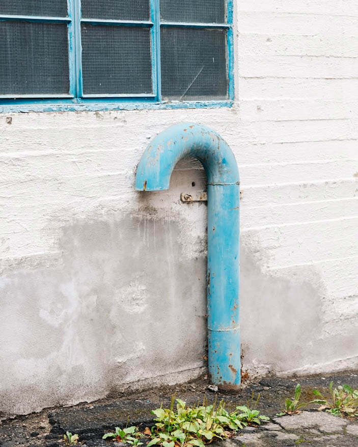
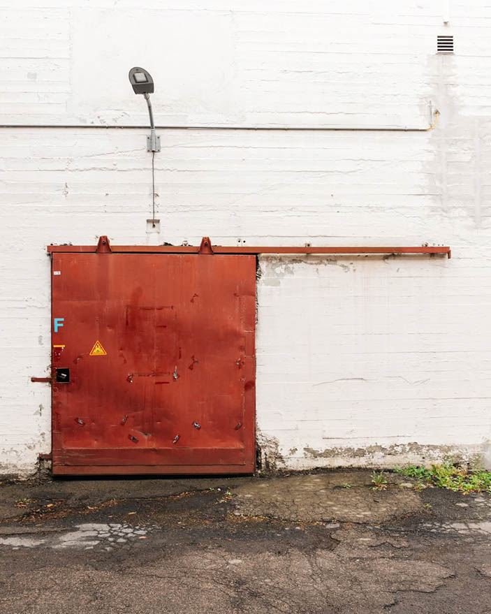
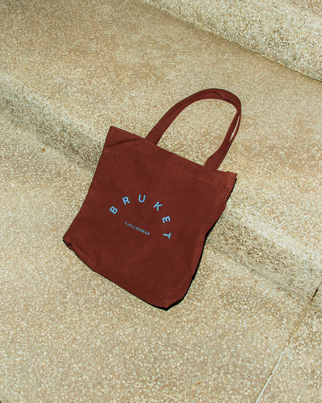
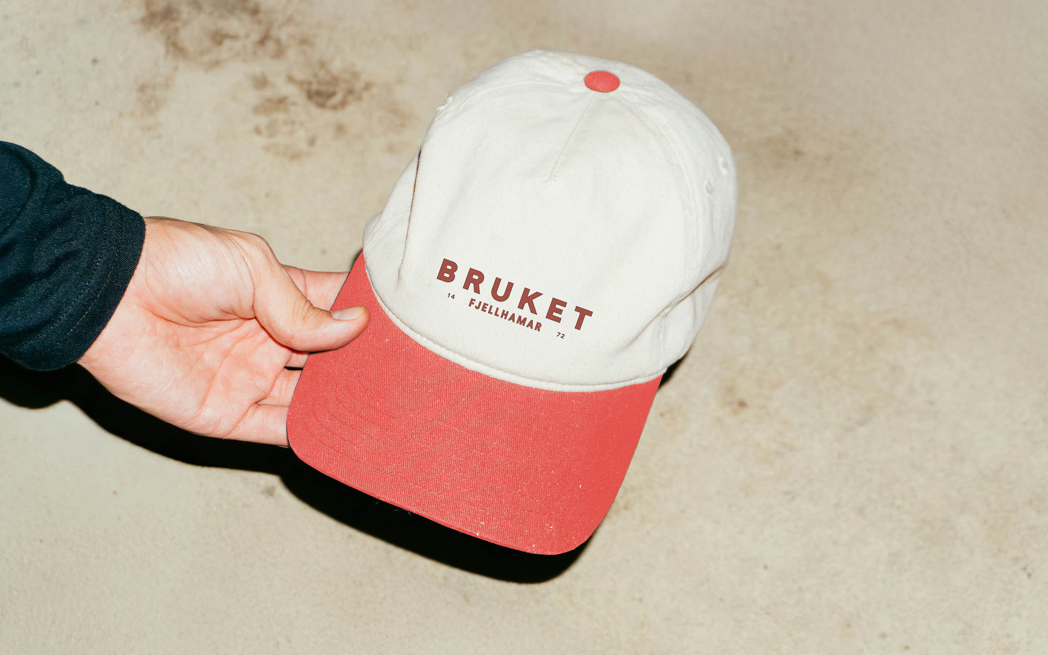
The core color palette references the building’s materials and patina, featuring dusty blues, antique white, vintage brick, and bright rust red.
Pulse as Rhythm
01. The literal pulse of the factory is related to the repetition of tasks that culminate in the production of a final product.
02. Pulse changes based on activity and environment.
03. Rhythm is created by contrasting a sound or object to silence or negative space. Like a clock ticking or a heart beating.
02. Pulse changes based on activity and environment.
03. Rhythm is created by contrasting a sound or object to silence or negative space. Like a clock ticking or a heart beating.
01. Repetition
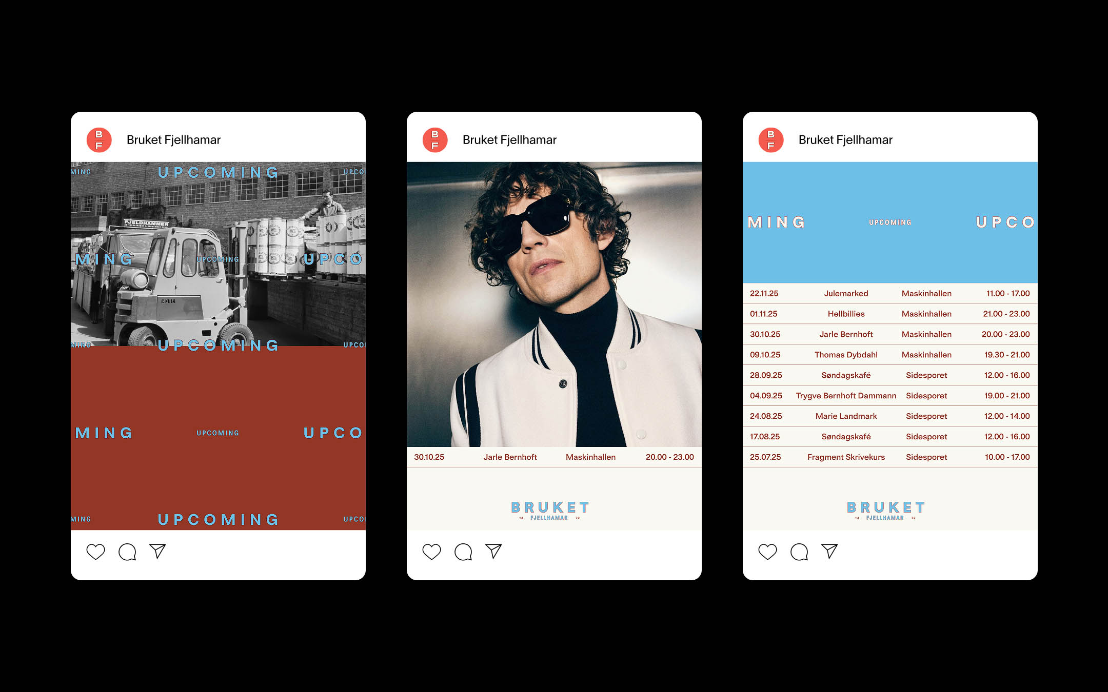
Bruket fjellhamar
Visual Identity & Web
02. Energy
03. Time

Project description
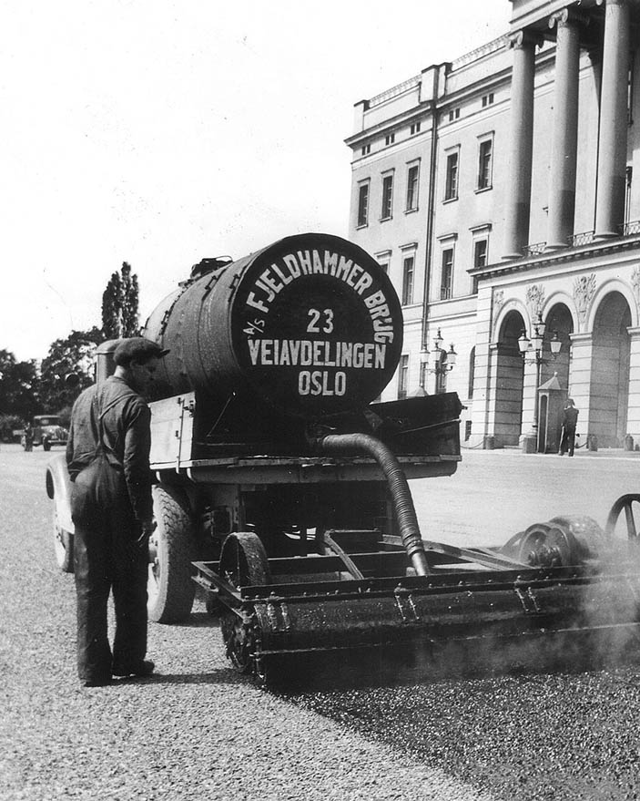
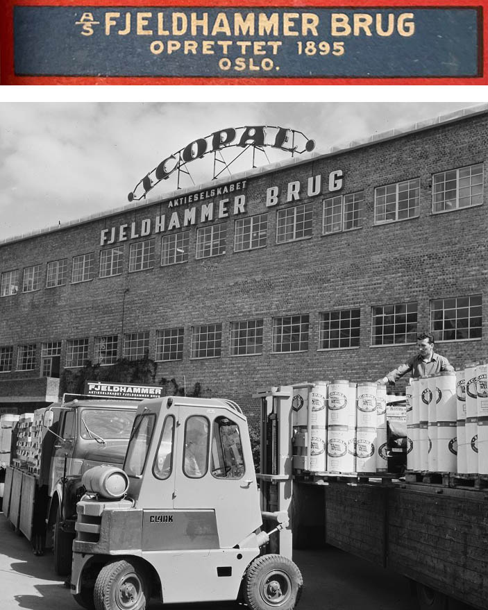
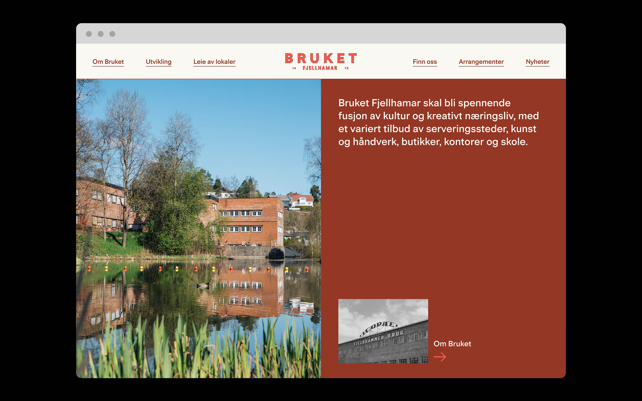
Bruket Fjellhamar is a real-estate development led by Solon Eiendom in collaboration with place-strategy specialists Natural State. Together, they are transforming a former factory into a cultural hub where the Fjellhamar community can gather around art, music, dining, and work. Located on the banks of Sagelva, the site has a long industrial history as a sawmill, paperboard plant, and asphalt factory. Today, it is entering a new chapter.
During 2024–2025, I worked on developing Bruket Fjellhamar’s visual identity, building on Natural State’s strategic foundation. My role covered the full spectrum—from concept and identity design to web, social media, and signage and wayfinding.
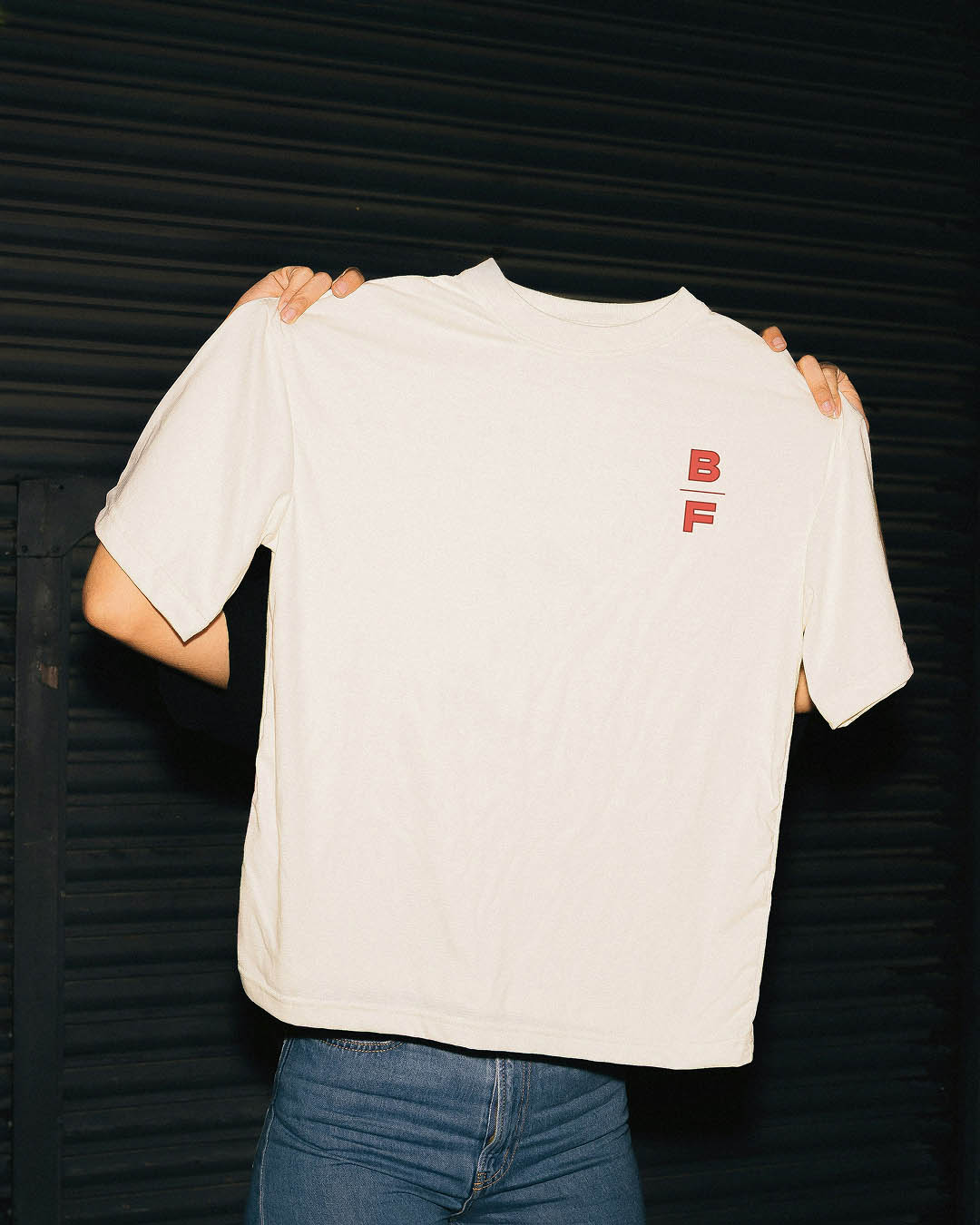
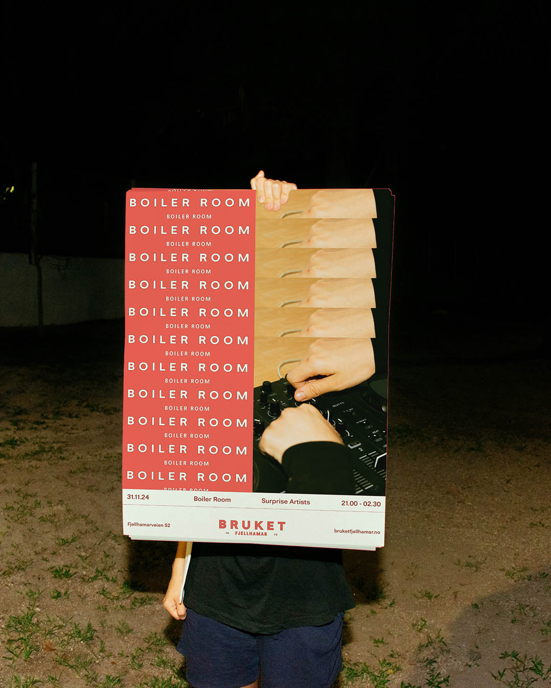
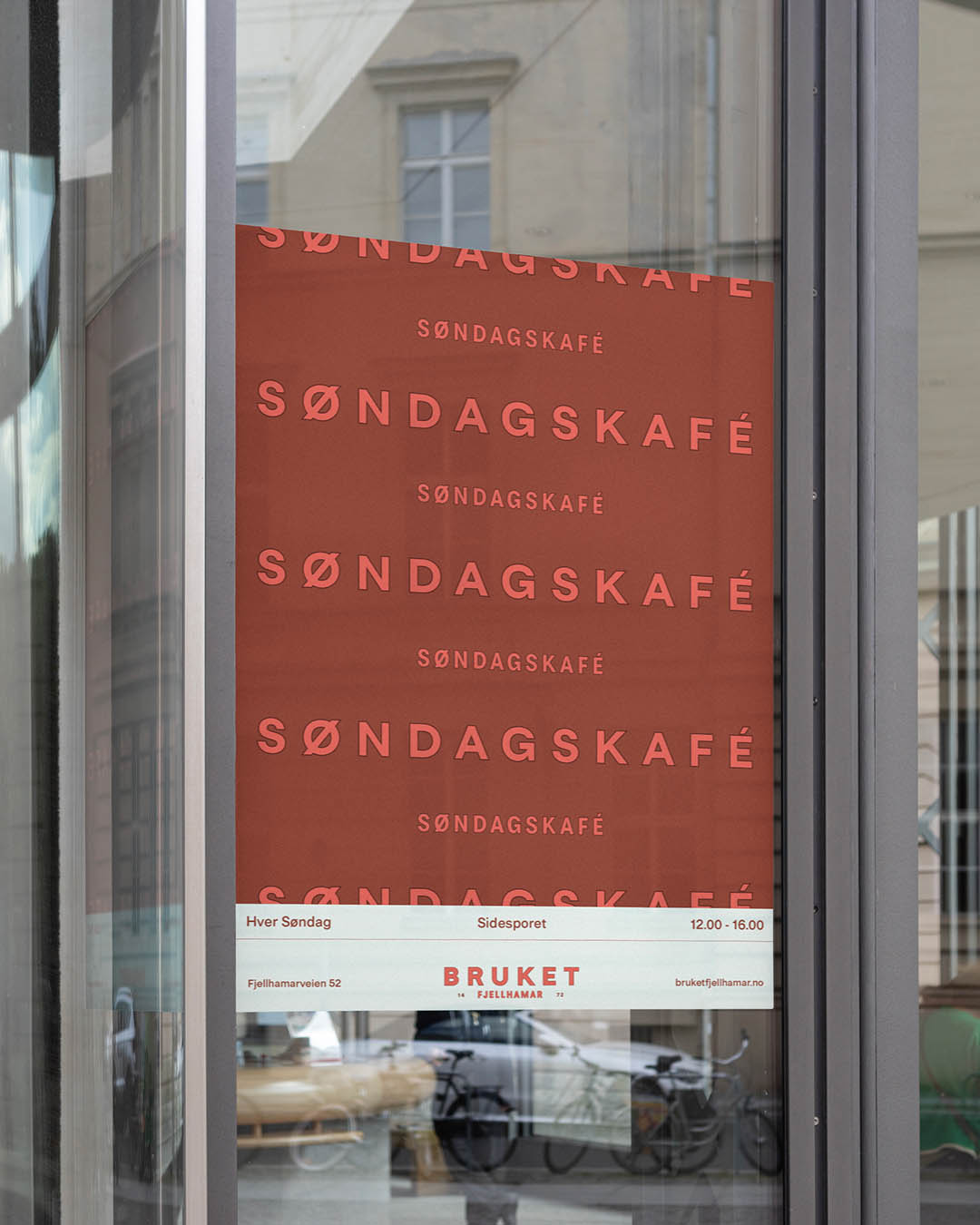
The identity is rooted in the site’s industrial past. The logo is designed in several formats, which is practical, but is also a deliberate nod to vintage design restrictions where having a single logo file to pass around wasn’t attainable. Large logo versions incorporate Fjellhamar’s postal code to strengthen the local connection. The color palette draws from the building itself and subtly echoes the Norwegian flag, celebrating the country’s industrial heritage. Adding a stroke to the modern neo-grotesk typeface Tiny Grotesk further reinforces the vintage trypographic treatment.
The communication concept, "Fabrikkens puls" (“The factory’s pulse”), interprets pulse as rhythm. Rhythm—defined by repetition, energy, and time—translates visually into pattern, space, and scale, serving as the base for a flexible layout system adaptable to events with different perceived “pulses.”
During 2024–2025, I worked on developing Bruket Fjellhamar’s visual identity, building on Natural State’s strategic foundation. My role covered the full spectrum—from concept and identity design to web, social media, and signage and wayfinding.
The identity is rooted in the site’s industrial past. The logo is designed in several formats, which is practical, but is also a deliberate nod to vintage design restrictions where having a single logo file to pass around wasn’t attainable. Large logo versions incorporate Fjellhamar’s postal code to strengthen the local connection. The color palette draws from the building itself and subtly echoes the Norwegian flag, celebrating the country’s industrial heritage. Adding a stroke to the modern neo-grotesk typeface Tiny Grotesk further reinforces the vintage trypographic treatment.
The communication concept, "Fabrikkens puls" (“The factory’s pulse”), interprets pulse as rhythm. Rhythm—defined by repetition, energy, and time—translates visually into pattern, space, and scale, serving as the base for a flexible layout system adaptable to events with different perceived “pulses.”
Credits
Veronica Mike:
Creative Director
Laara Matsen:
Creative Director
Wenche Taugbøl:
Account manager