


Project description
In 2020, together with the team at Mos, I had the opportunity to work on the strategy and identity for Grønnegata 6. Grønnegata 6 is a residential property in the Homansbyen neighborhood in central Oslo. Bjerke Eiendom, the owners of the property, needed to reposition Grønnegata 6 as a modern, vibrant, and flexible alternative to buying an apartment.
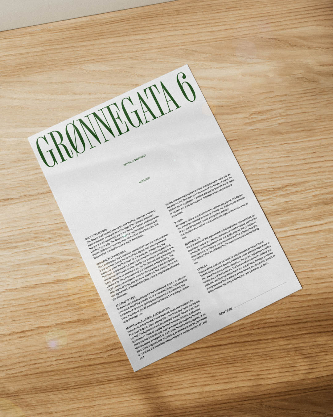
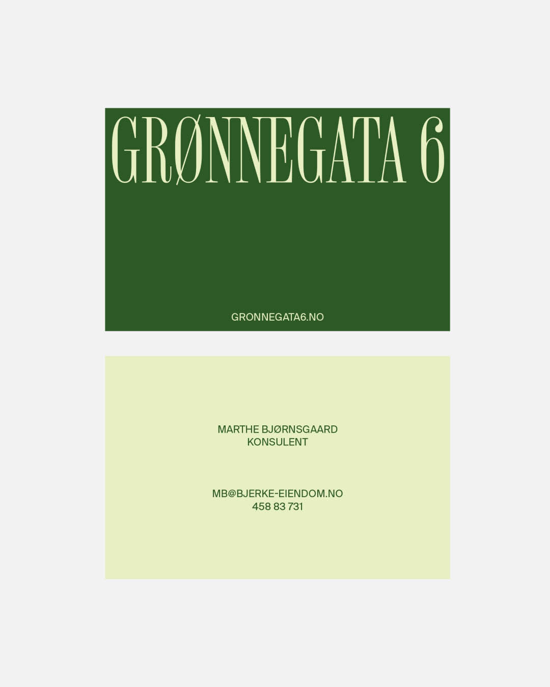
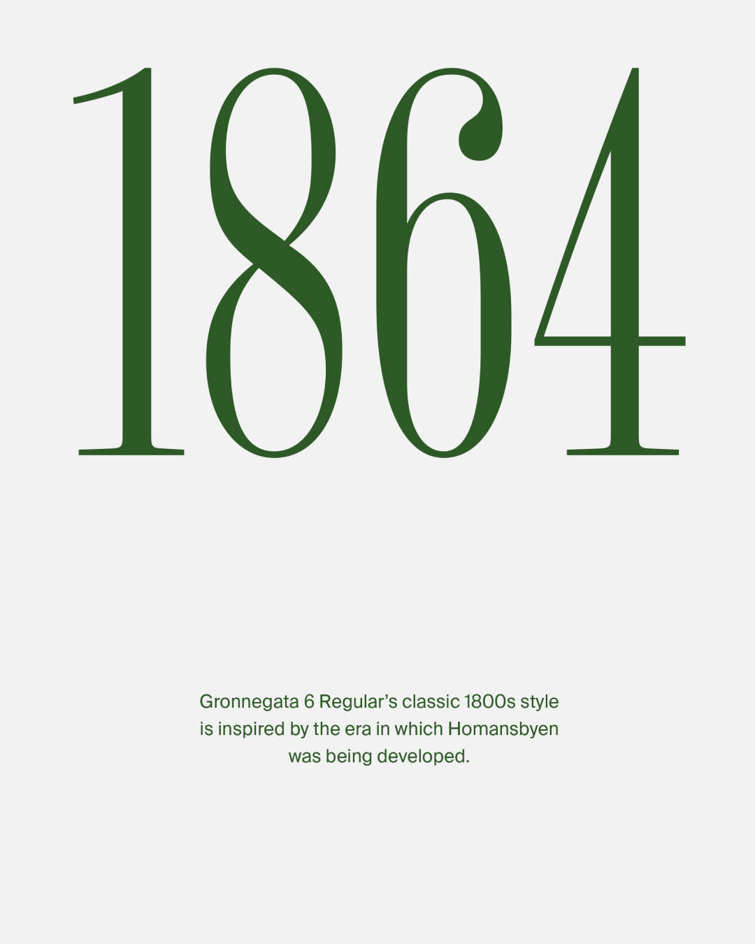
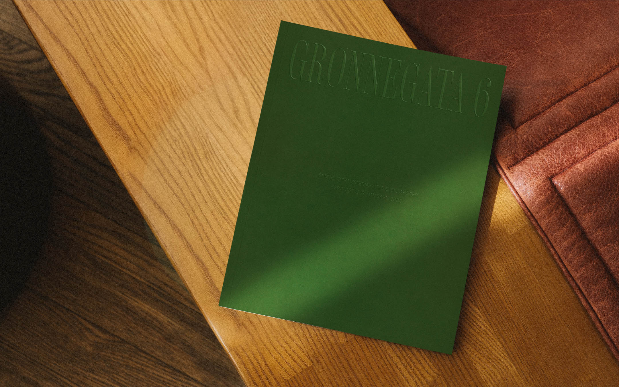
The visual identity balances Grønnegata 6’s high-end location with the apartments' contemporary and streamlined living. The wordmark was designed from a custom typeface created by Monokrom for this project. Its classic 1800s style is inspired by the era in which Homansbyen was developed. The logo application is almost always oversized, which creates a playful harmony in contrast to the traditional typography.
Warm and sunny analog photographs bring the surrounding area to life in a way that reminds people that life can always be treated more like a holiday. Additionally, center-oriented layouts on everything from the website to the prospect reference the idea that the renter’s freedom is central to a happy life, and the Bjerke Eiendom understands that.
Credits
Julianne Leikanger:
Photographer
Monokrom:
Font Design
Skogen:
Web Development