Project description
After establishing the new visual identity for Røros Drikkeri, the next step was to apply the brand to its most important touchpoint: the product itself. A central challenge of this phase was finding the right balance between evolution and renewal—respecting the brand’s existing equity while introducing a new expression, which was a necessary change.
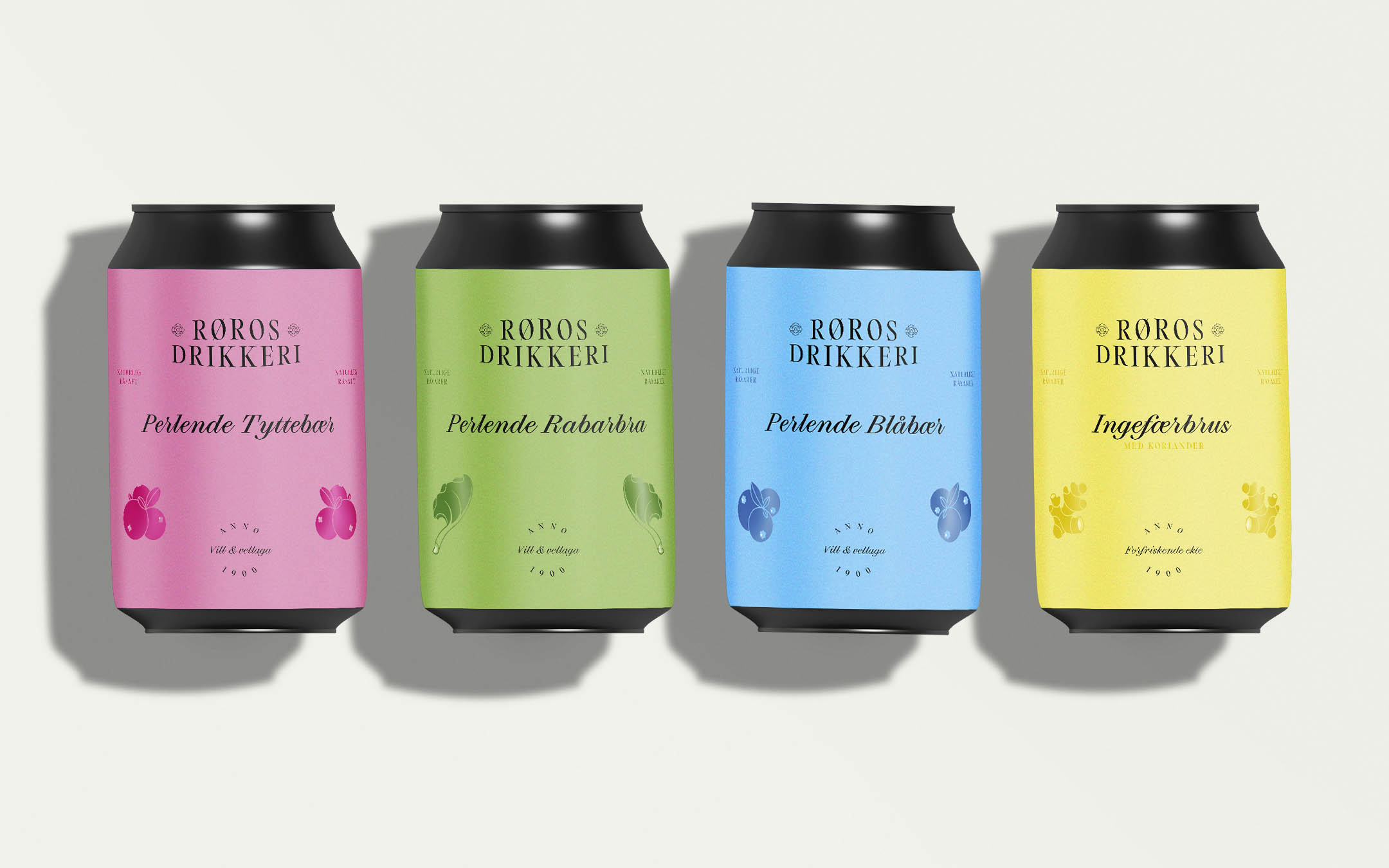
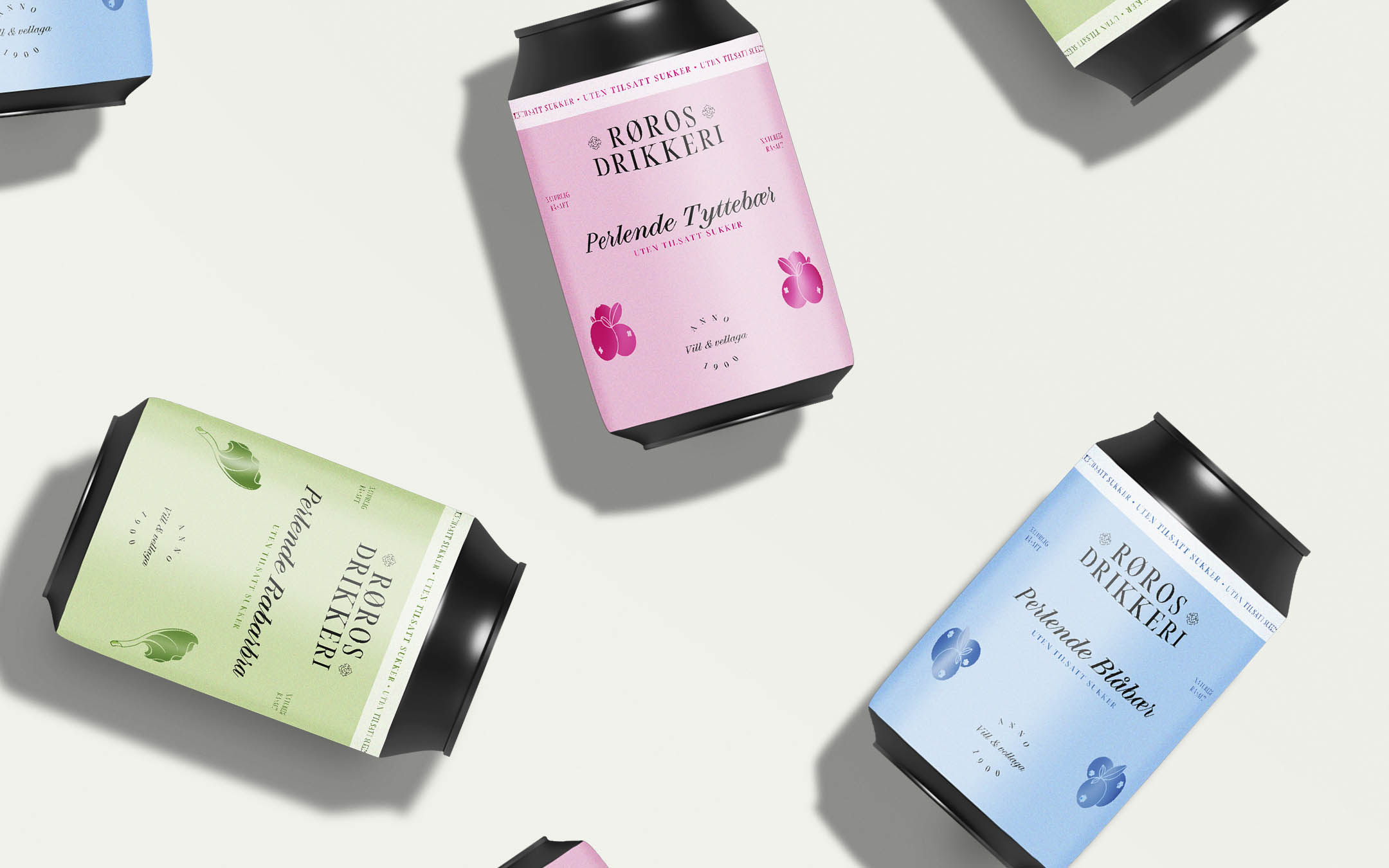
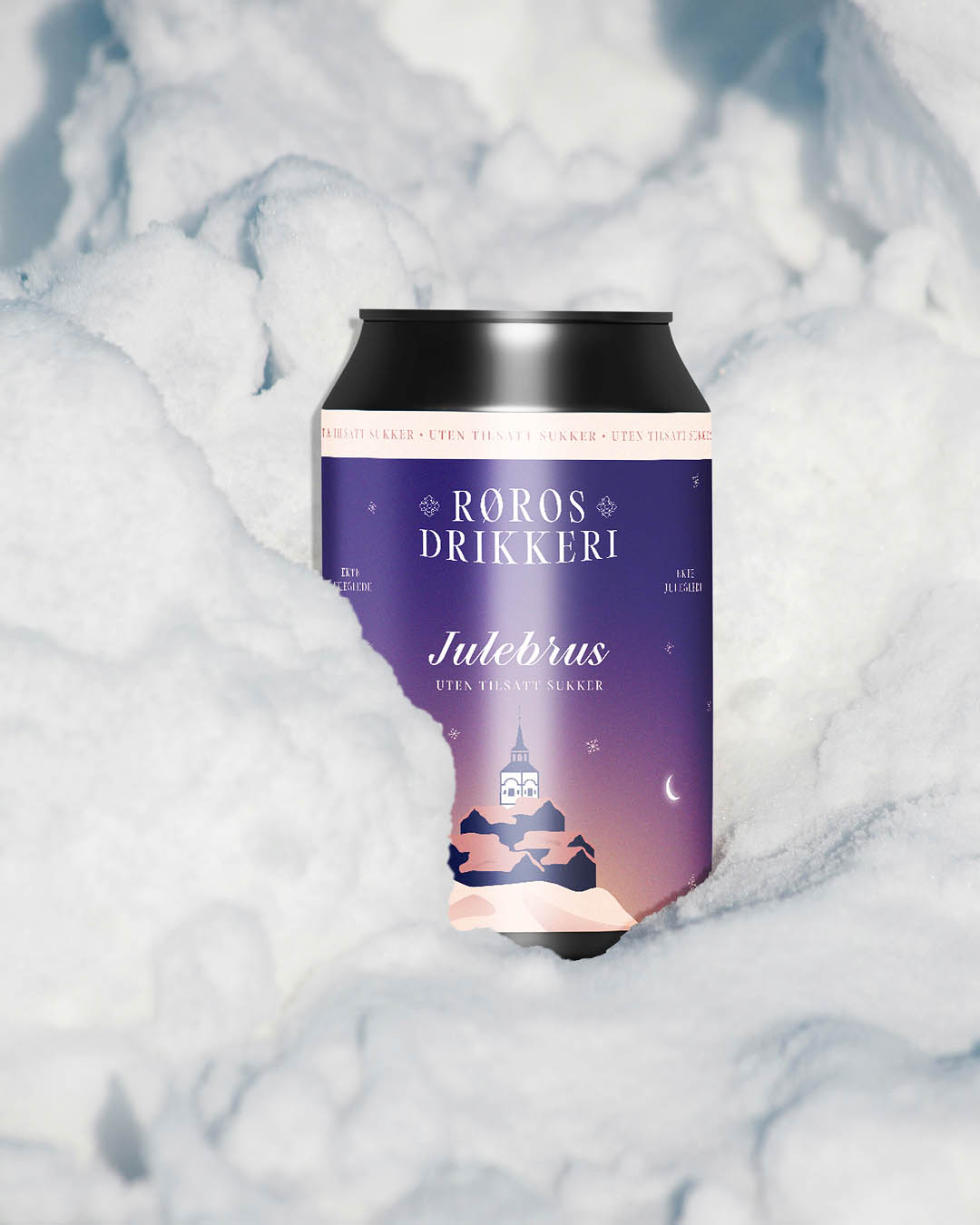
A key element of the rebrand’s communication strategy was the phrase ”forfriskende ekte” (“refreshingly real”), which informed the evolution of the flavor colour system. Previously, the label colours were muted and dusty. In the new system, the colors are brighter, clearer, and more consistent across the range. This shift also supported the introduction of sugar-free versions of the core products. By deepening and intensifying each flavor color, the system allowed for the use of tints to clearly differentiate between regular and sugar-free variants while maintaining a cohesive visual language.
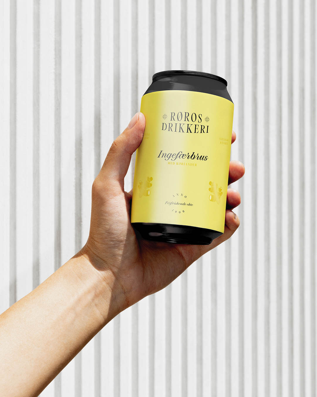
Materiality was another important focus of the redesign. Durability is essential for any beverage product, but the price point of the drinks also called for a more premium feel than the previous labels conveyed. To achieve this, we developed a material system using matte label paper combined with metallic foil accents. The foils are applied selectively—to the flavor icons, typographic details, and highlights that distinguish regular drinks from sugar-free options—adding tactility and visual refinement without overpowering the design.
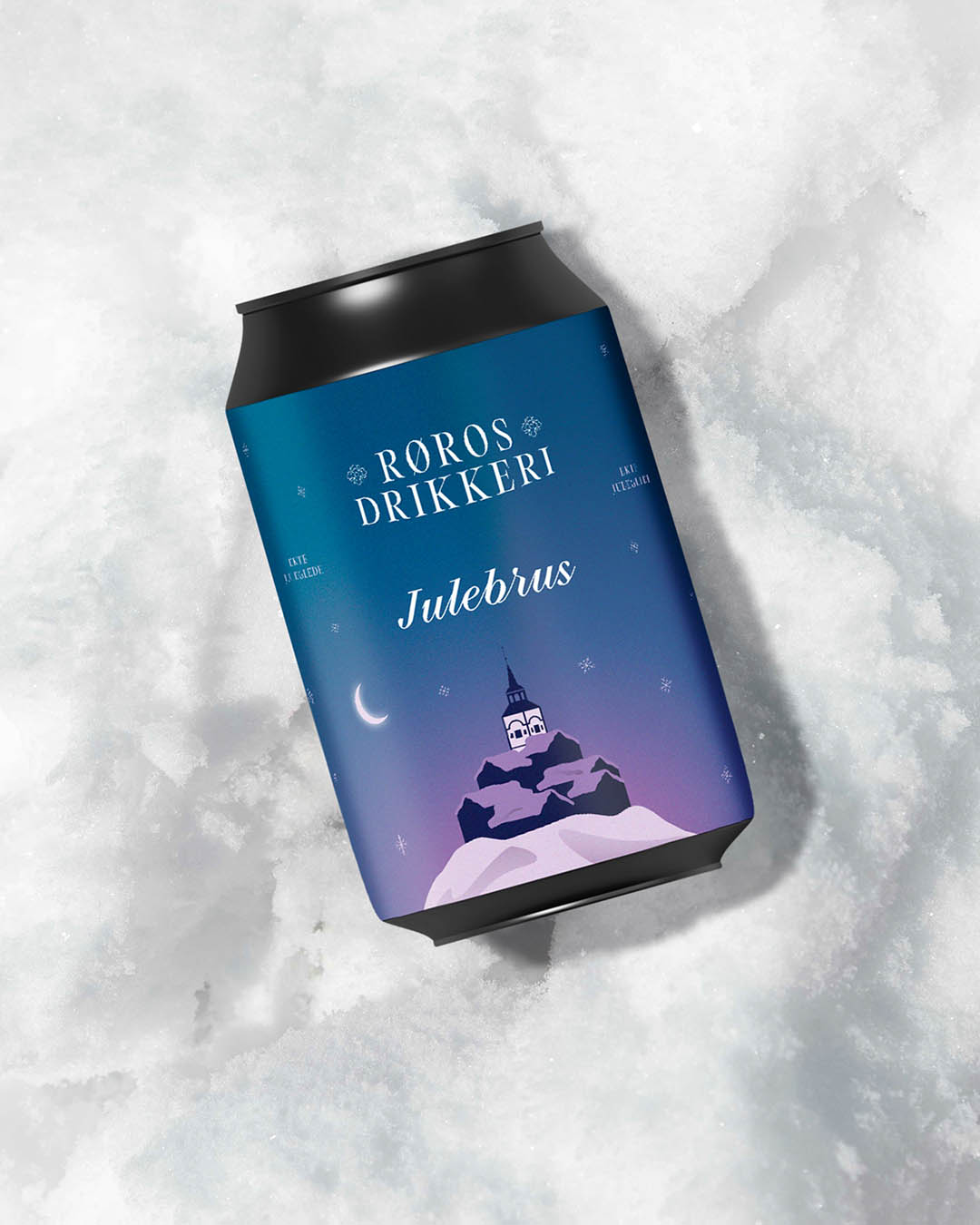
Special edition flavors were also identified as strategically important for the brand. The label system therefore needed to be consistent, yet flexible enough to allow for more expressive and distinctive designs for products such as Julebrus.
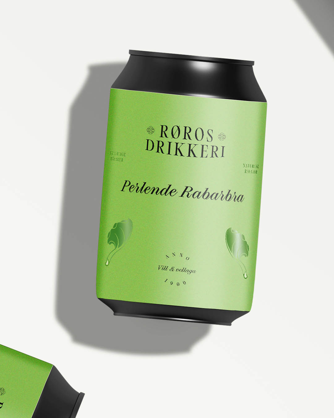
The final label system uses space strategically, dividing the front of the label into three clear zones: the top third for branding, the middle third for flavour communication, and the bottom third for decorative and expressive elements. This structure provides a strong and consistent framework for the core range, while also creating a flexible canvas for more illustrative, creative expressions in limited-edition and seasonal releases.
A key element of the rebrand’s communication strategy was the phrase ”forfriskende ekte” (“refreshingly real”), which informed the evolution of the flavor colour system. Previously, the label colours were muted and dusty. In the new system, the colors are brighter, clearer, and more consistent across the range. This shift also supported the introduction of sugar-free versions of the core products. By deepening and intensifying each flavor color, the system allowed for the use of tints to clearly differentiate between regular and sugar-free variants while maintaining a cohesive visual language.
Materiality was another important focus of the redesign. Durability is essential for any beverage product, but the price point of the drinks also called for a more premium feel than the previous labels conveyed. To achieve this, we developed a material system using matte label paper combined with metallic foil accents. The foils are applied selectively—to the flavor icons, typographic details, and highlights that distinguish regular drinks from sugar-free options—adding tactility and visual refinement without overpowering the design.
Special edition flavors were also identified as strategically important for the brand. The label system therefore needed to be consistent, yet flexible enough to allow for more expressive and distinctive designs for products such as Julebrus.
The final label system uses space strategically, dividing the front of the label into three clear zones: the top third for branding, the middle third for flavour communication, and the bottom third for decorative and expressive elements. This structure provides a strong and consistent framework for the core range, while also creating a flexible canvas for more illustrative, creative expressions in limited-edition and seasonal releases.