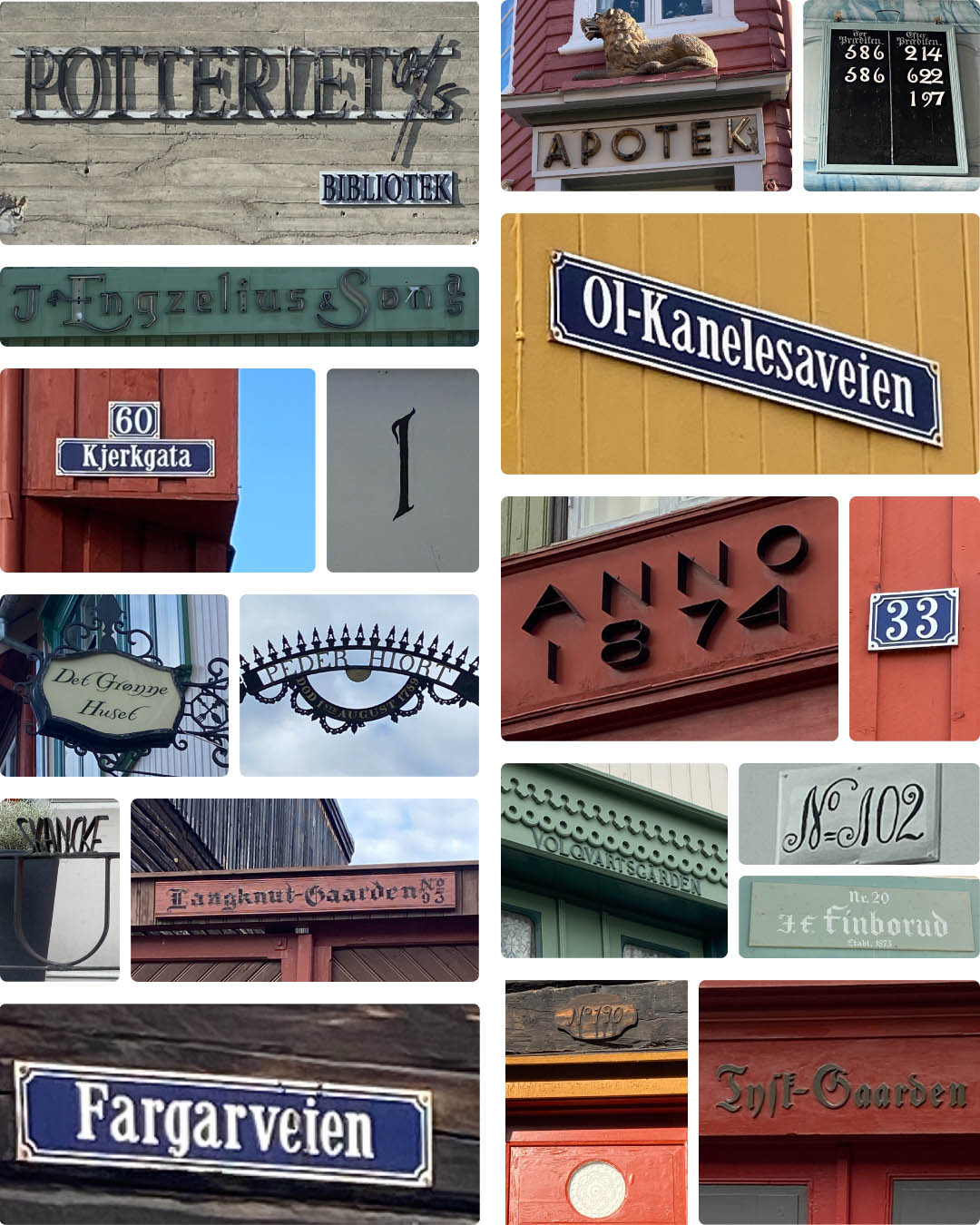
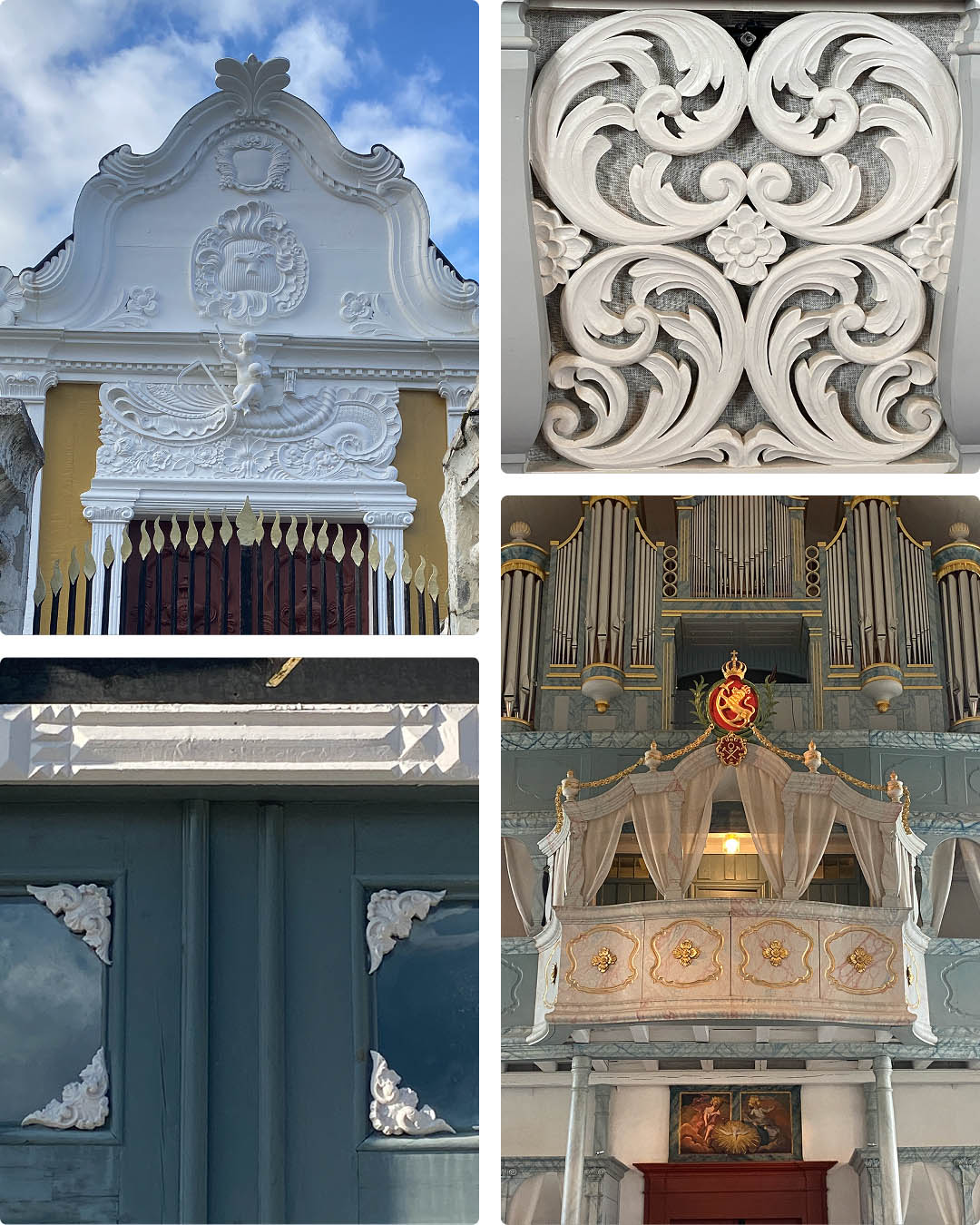
Røros is filled with unique typography, colors and symbols. While working out the direction of the new identity it was important the represent not just a soda company but the fabric and history of the this well-loved town.


Project description
Røros Bryggeri og Mineralvannfabrikk is a well-known, family-owned beverage company with a 125-year history. In 2023, the company separated its alcoholic beverage production from its brewery in order to expand vendor opportunities for its much-loved natural soft drinks.
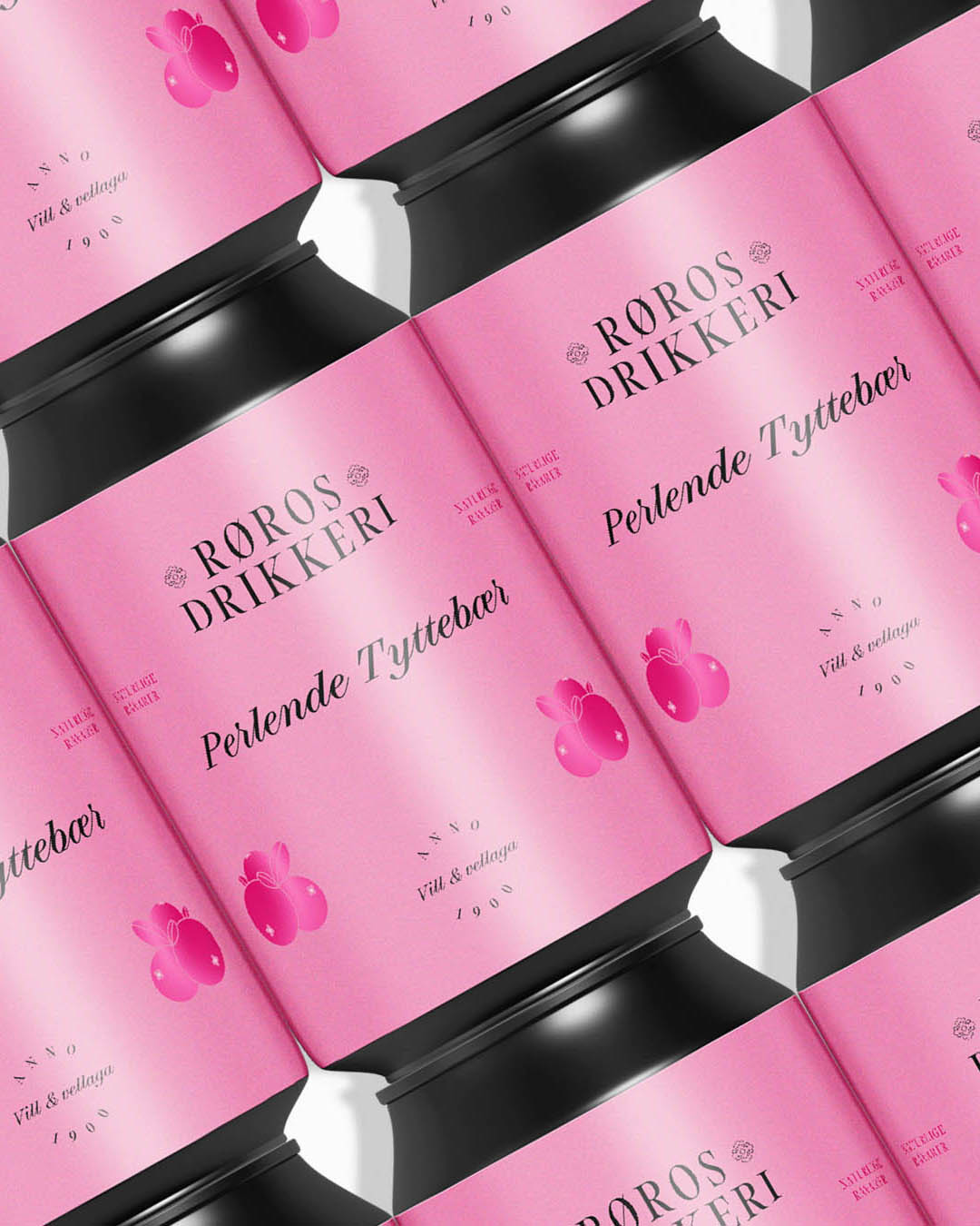
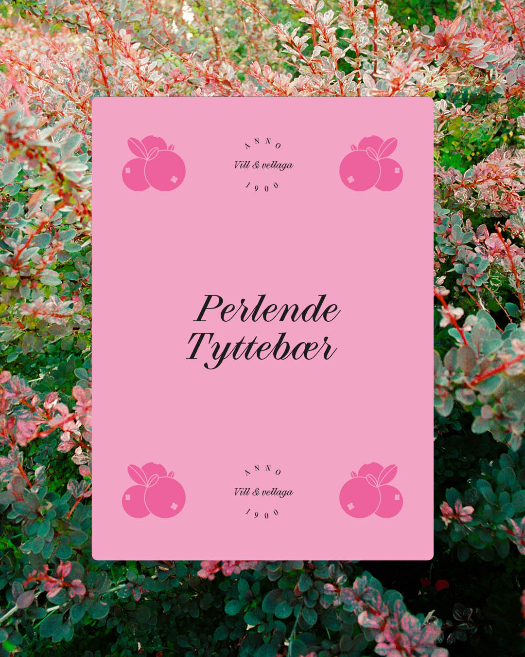
Røros Drikkeri, the new brand created exclusively for soft drinks, needed a visual direction that would help establish its position in both the alcohol-alternative and traditional soda markets. It was also important to build on the existing design language—such as black cans and color-coded labels—to maintain strong product recognition.
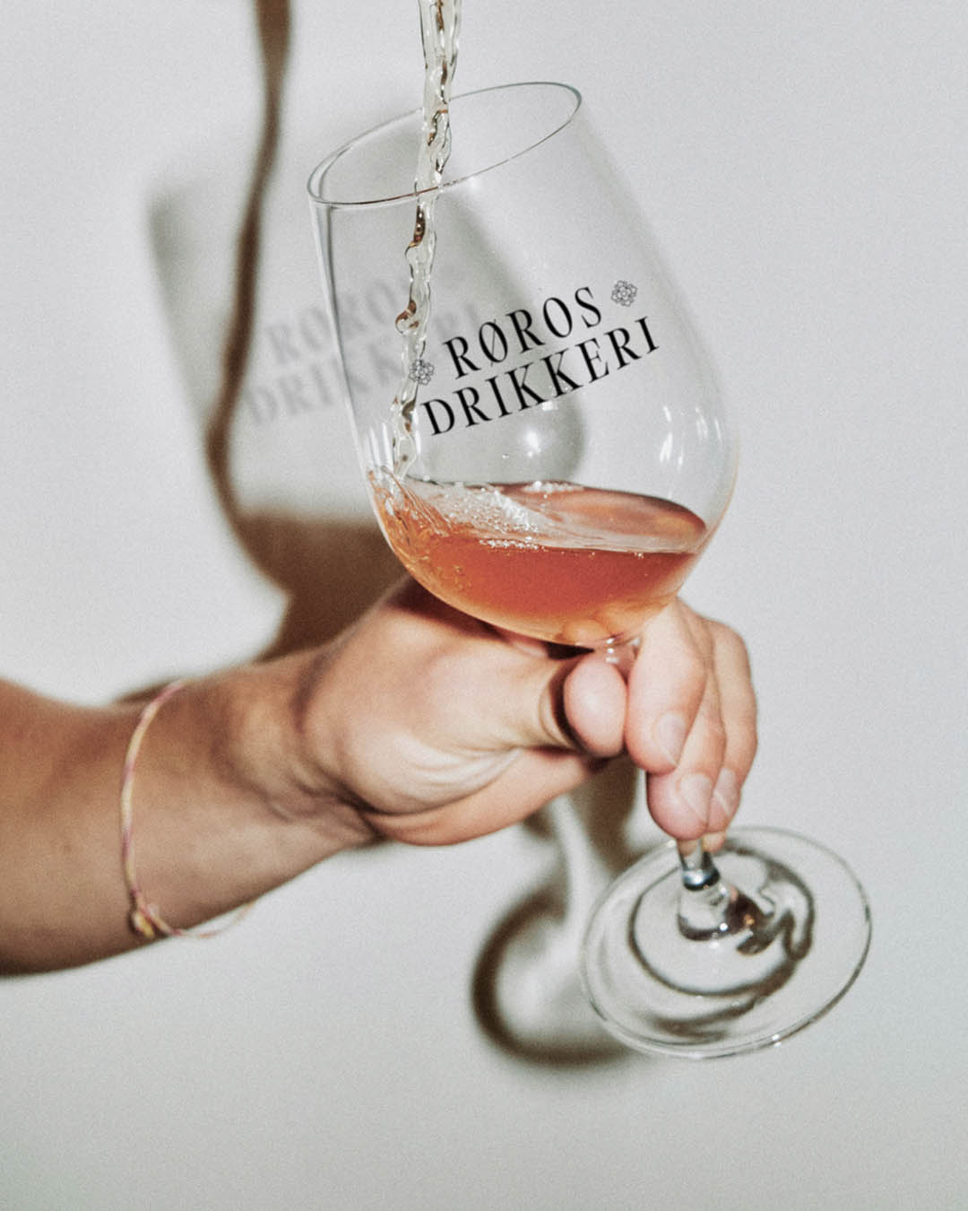
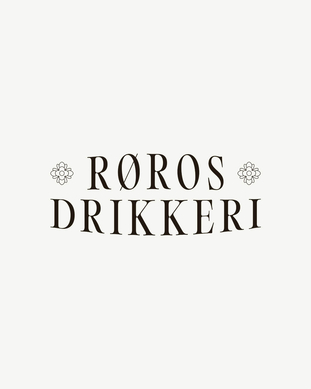
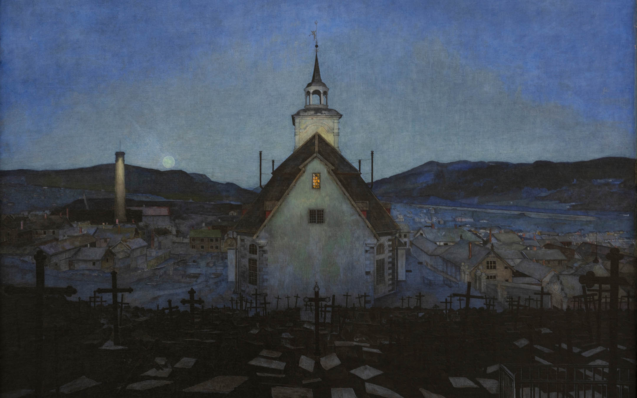
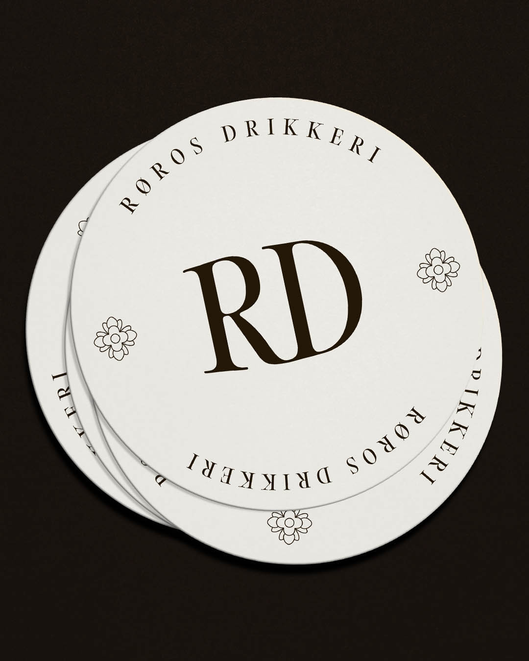
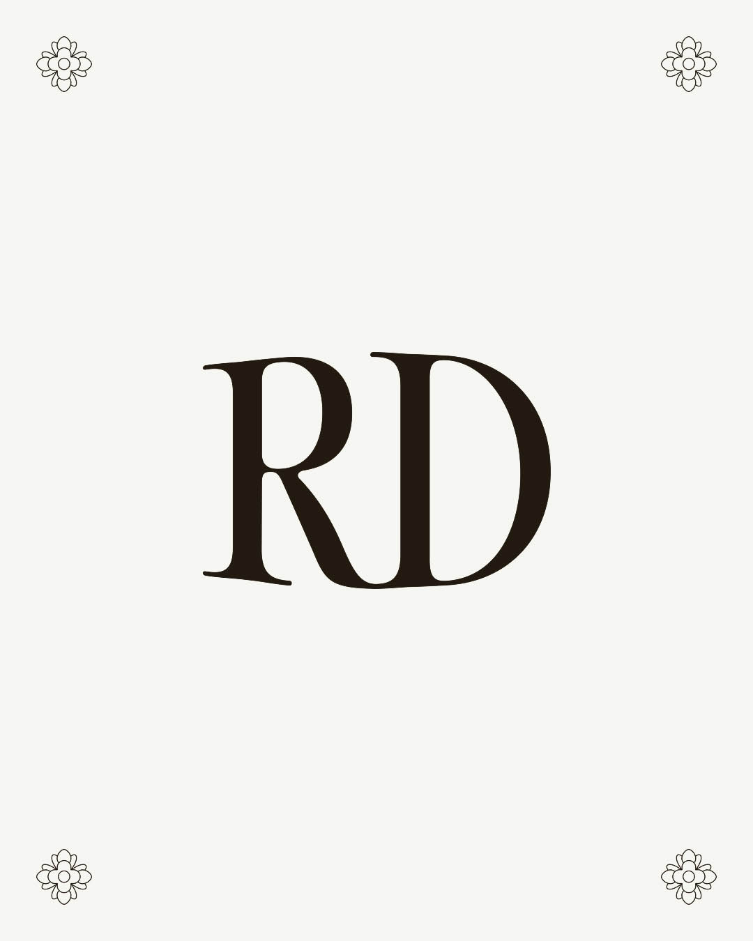
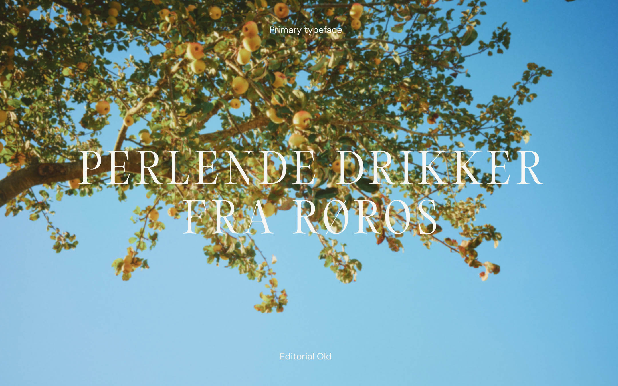
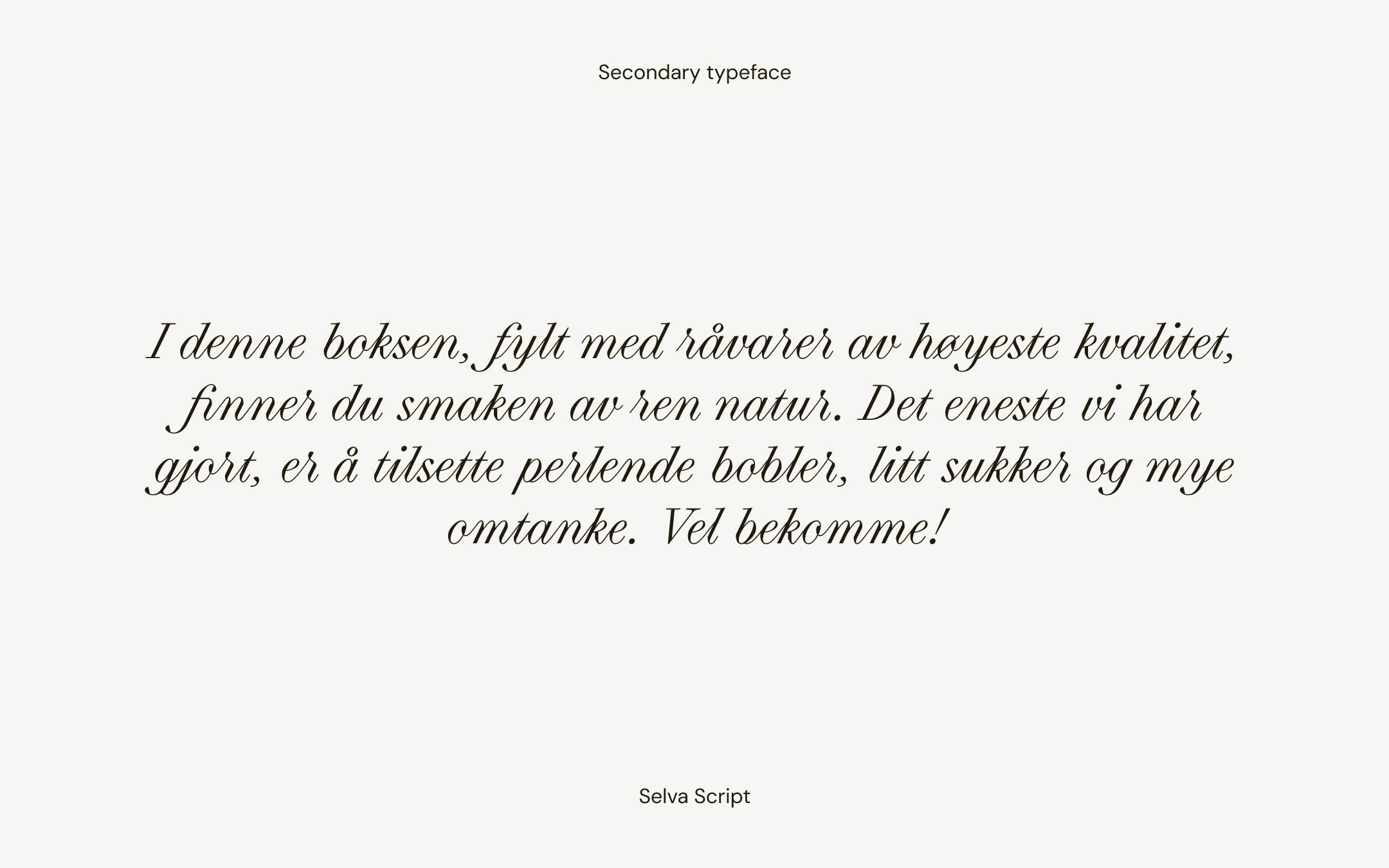
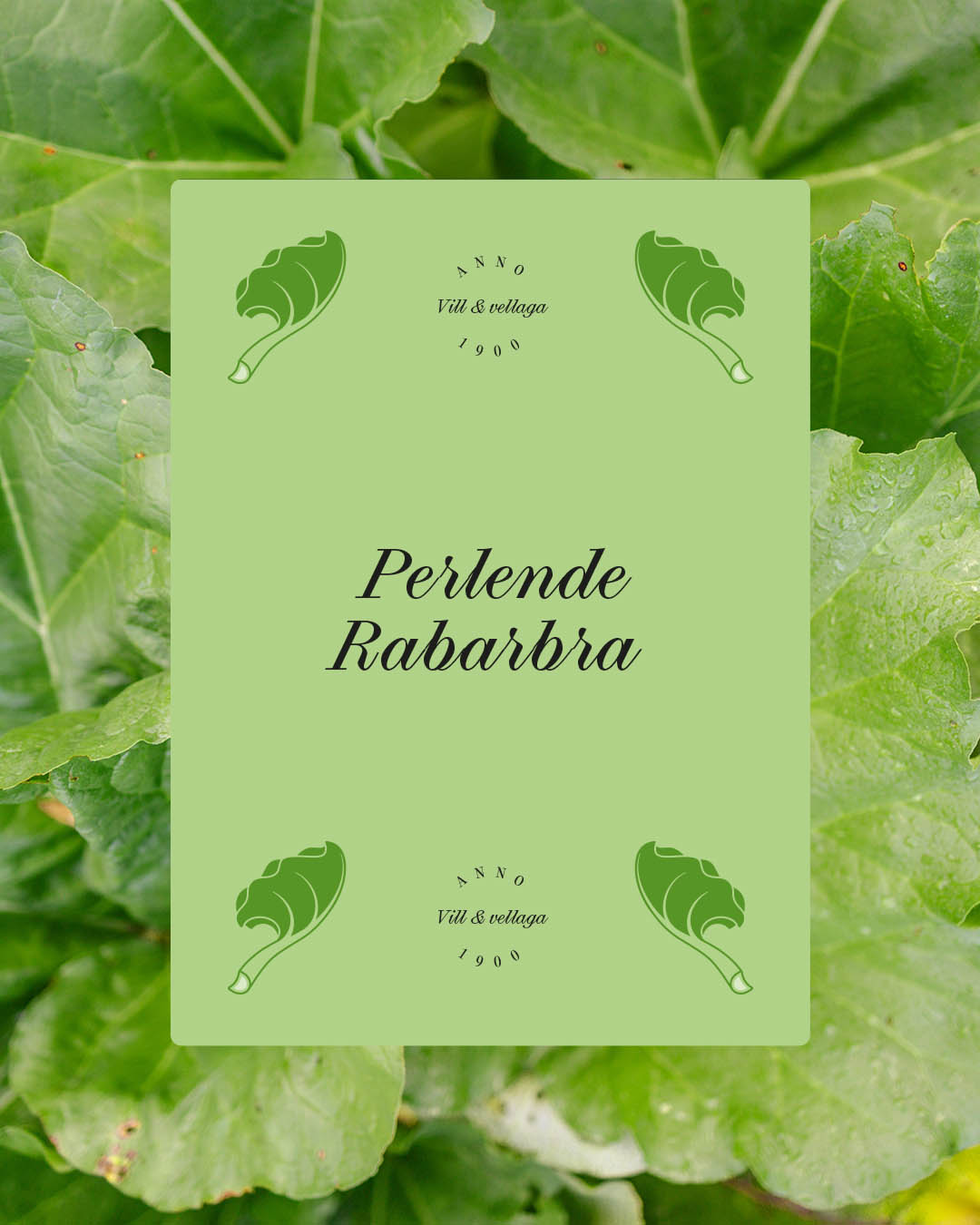
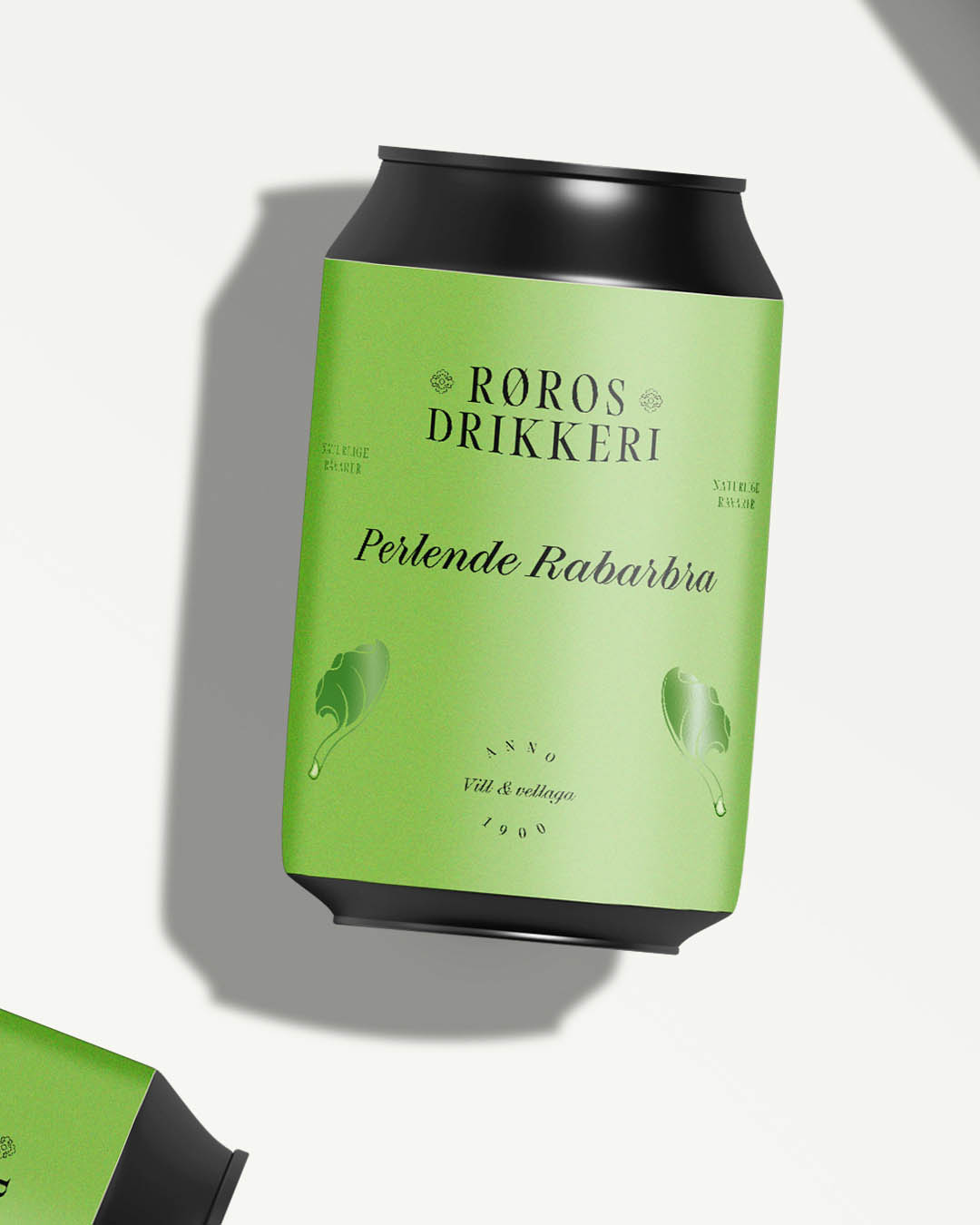
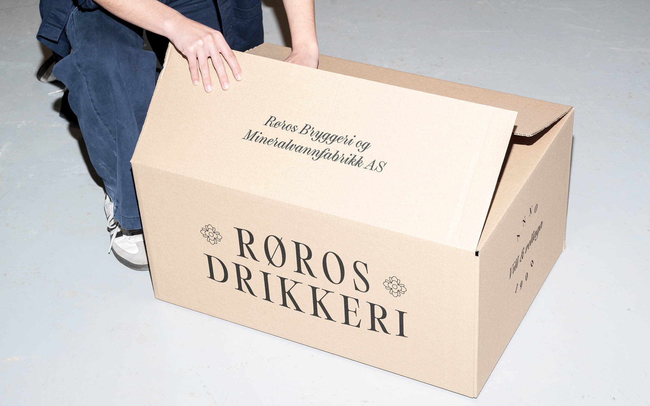
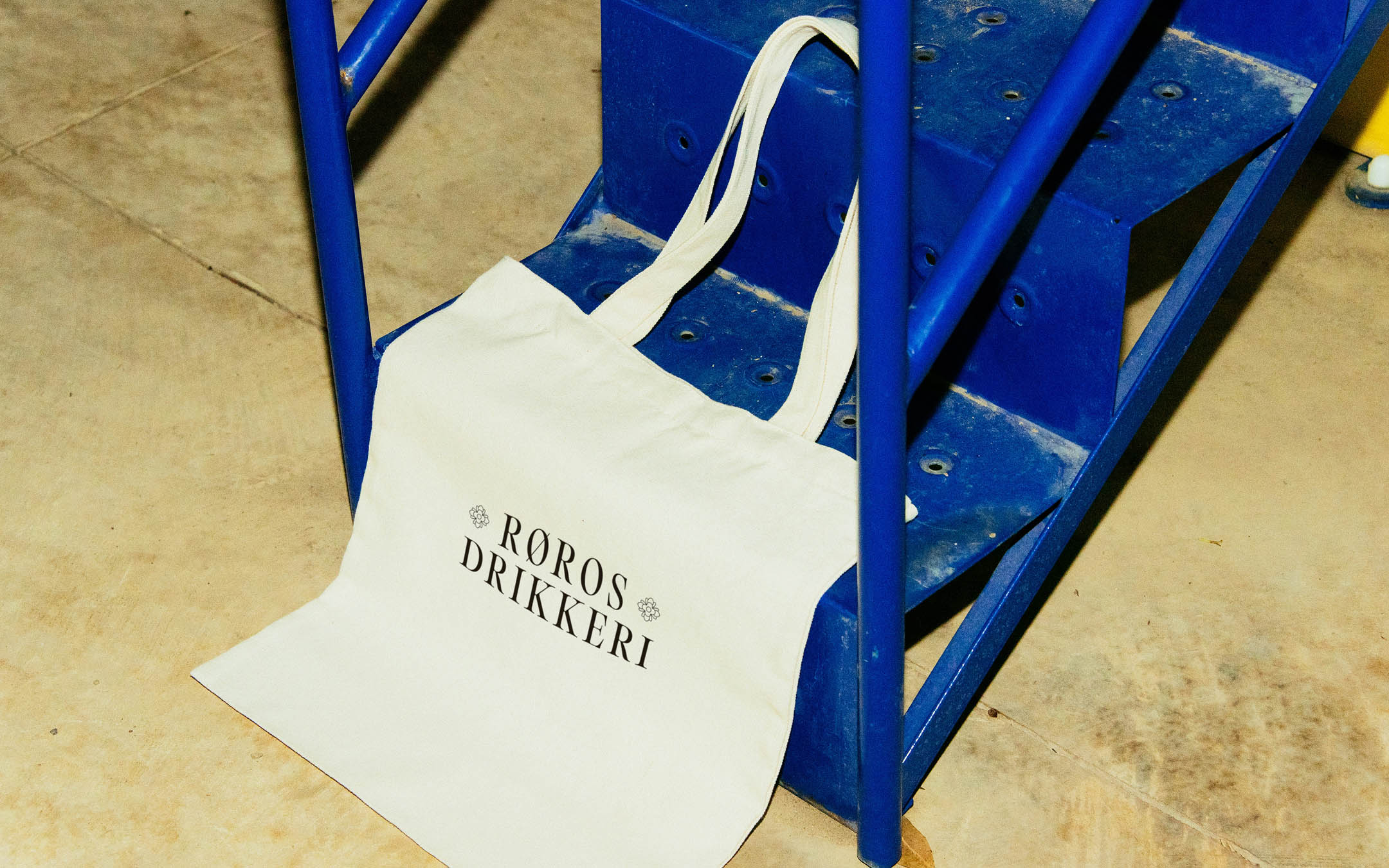
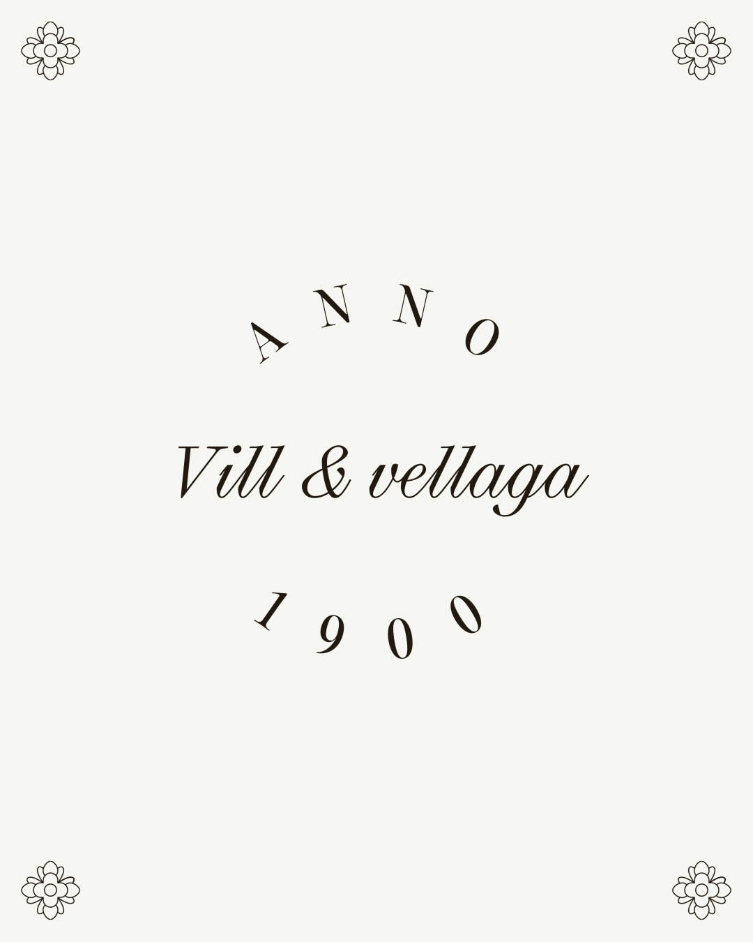
The resulting identity combines traditional elements with a modern, clear sensibility. The logo features a simple wordmark set in Editorial Old, paired with an icon of a rococo rose taken directly from the interior carvings of Røros Kirke, the town’s most recognizable landmark. The main street of Røros, speckled with handmade shop signs, inspired a tactile, typographic quality within the identity. To reflect this heritage while remaining contemporary and functional, two expressive typefaces—Editorial Old and Selva Script—are used.
Soft black and white form the core color palette of the new visual identity. This restrained approach allows the brand to easily introduce new flavors over time, while letting the label colors stand out and catch attention on store shelves.
Røros Drikkeri, the new brand created exclusively for soft drinks, needed a visual direction that would help establish its position in both the alcohol-alternative and traditional soda markets. It was also important to build on the existing design language—such as black cans and color-coded labels—to maintain strong product recognition.
The resulting identity combines traditional elements with a modern, clear sensibility. The logo features a simple wordmark set in Editorial Old, paired with an icon of a rococo rose taken directly from the interior carvings of Røros Kirke, the town’s most recognizable landmark. The main street of Røros, speckled with handmade shop signs, inspired a tactile, typographic quality within the identity. To reflect this heritage while remaining contemporary and functional, two expressive typefaces—Editorial Old and Selva Script—are used.
Soft black and white form the core color palette of the new visual identity. This restrained approach allows the brand to easily introduce new flavors over time, while letting the label colors stand out and catch attention on store shelves.