Project description
Tide, an Oslo based architecture firm was in need of a new visual identity. In 2023 they approach Mos to help them create a simple, unique, and modern profile for their practice.
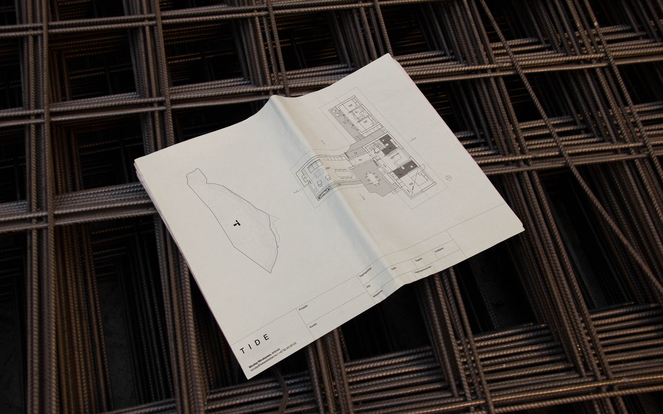
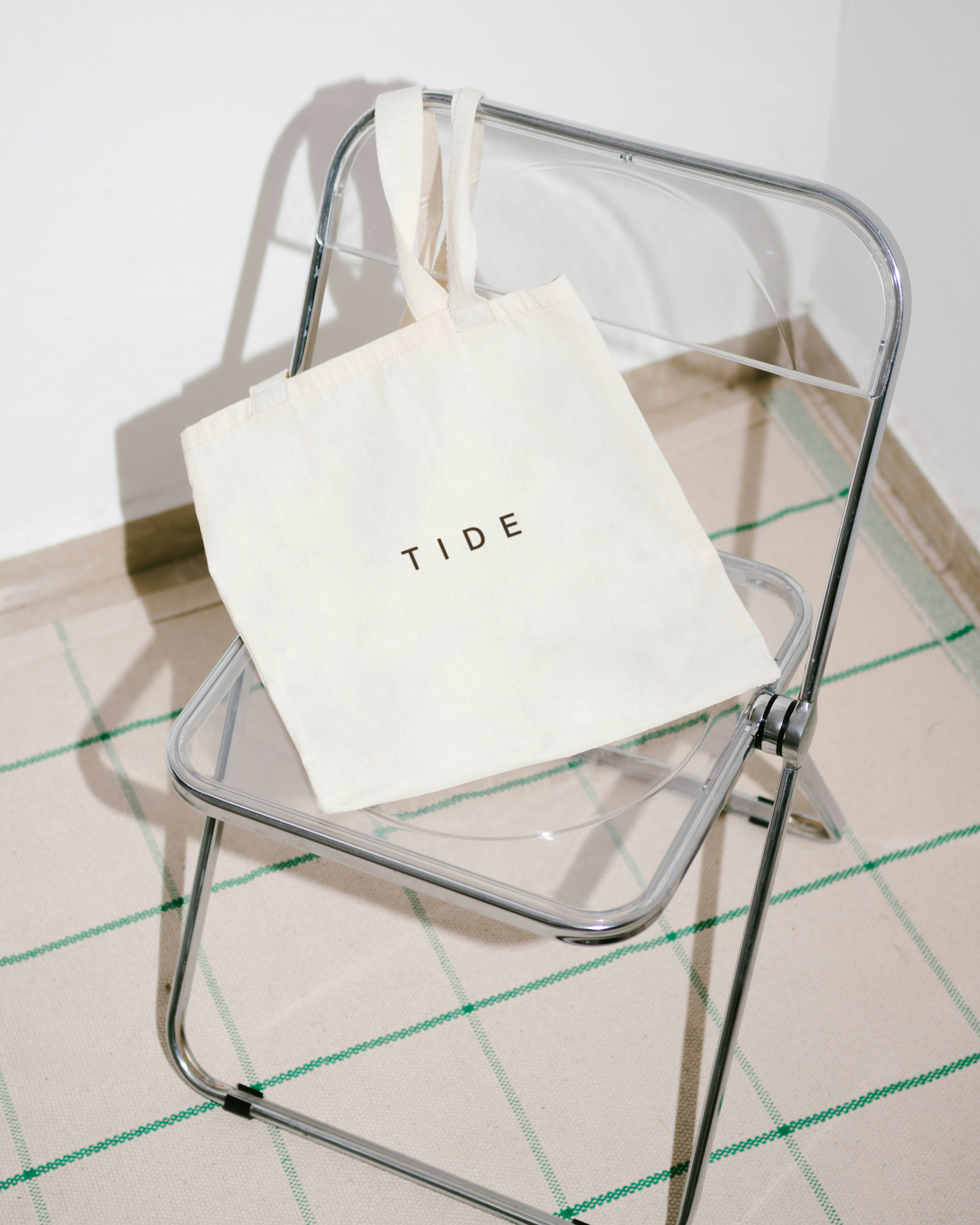
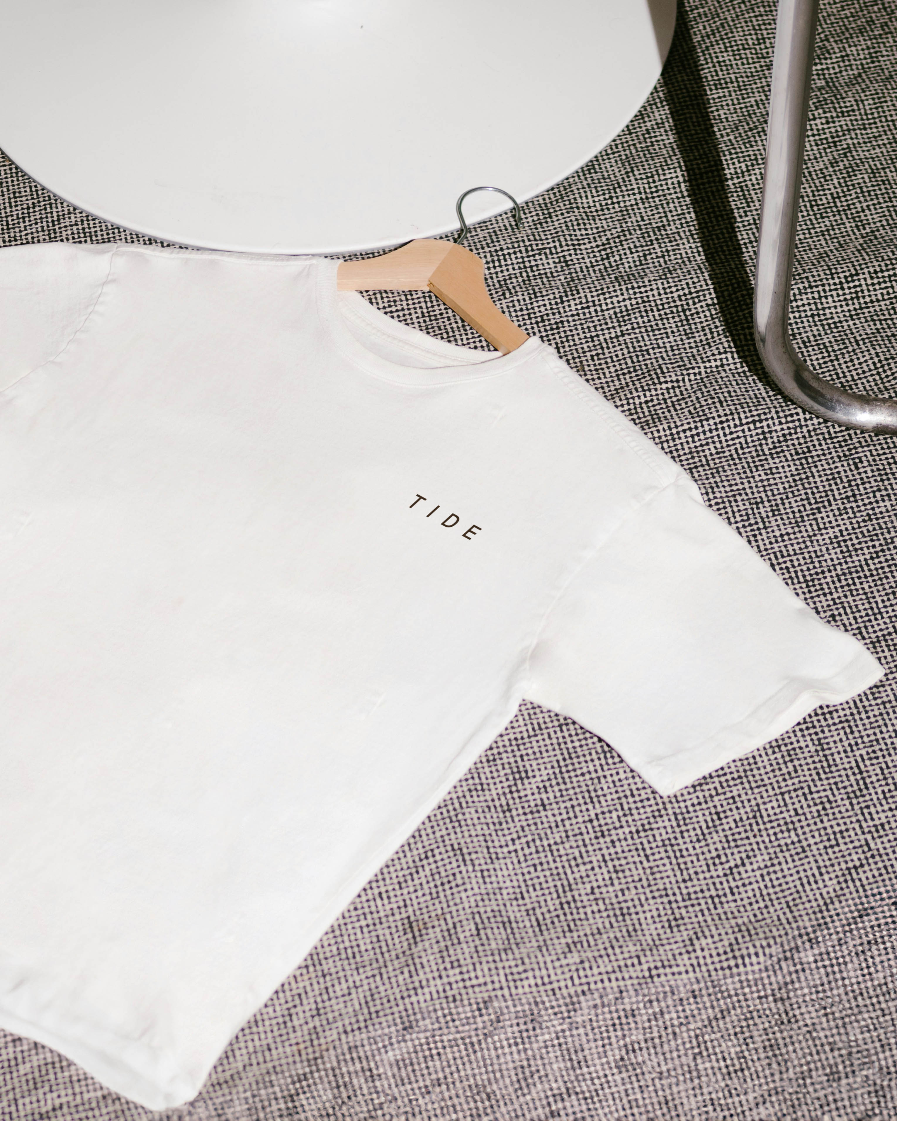
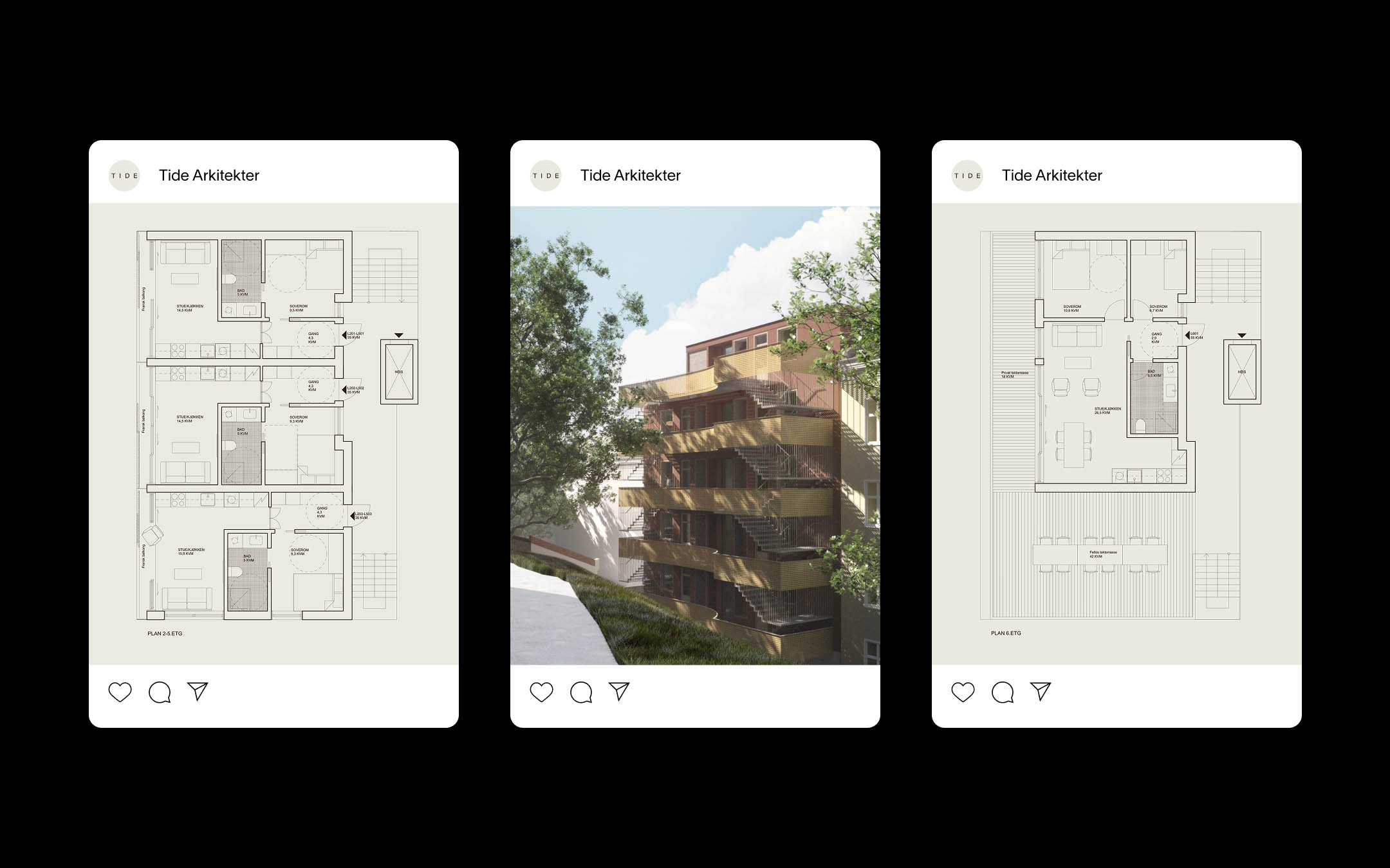
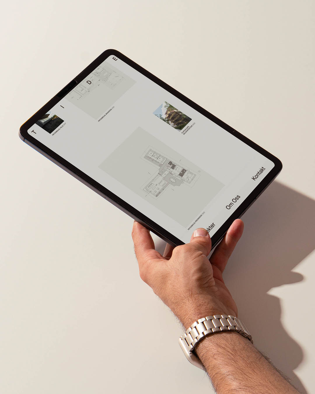
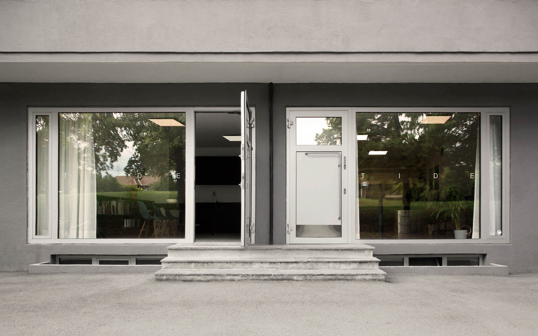
The identity is based on the concept of shaping space, where in design and architecture adding a an object to an environment changes the space itself. We wanted to create a logo that embodies this idea that an object affects its environment as much as the environment affects the object, and that the two live in symbiosis.
By creating a dynamic logo whose letter spacing adapts to the surface it is applied to we not only bring life to the logo but also acknowledge the environment which is typically overlooked as just a sheet of paper or a browser window. Further building on this idea, the Tide brand uses the inherent letter spacing of the logo to build the foundations for its flexible grid system.
Credits
Haider Ahmad:
Motion